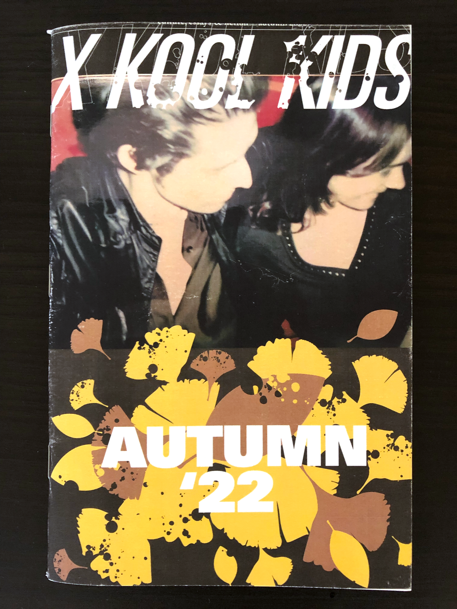
X Kool Kids is an independently produced, small batch zine printed quarterly. It's content focuses generally on culture, essays, and literary fiction, and is produced by a small group of Generation-Xers. It is sold at independent bookstores and record shops.
When we started down the path of visually describing and presenting the content, we decided pretty early that we didn't want X Kool Kids to just be about nostalgia. The content is fresh, and the aesthetic for the final product should be as well. It is, after all, it's own thing. And since it's in print, there's that analog excitement to play with as well.
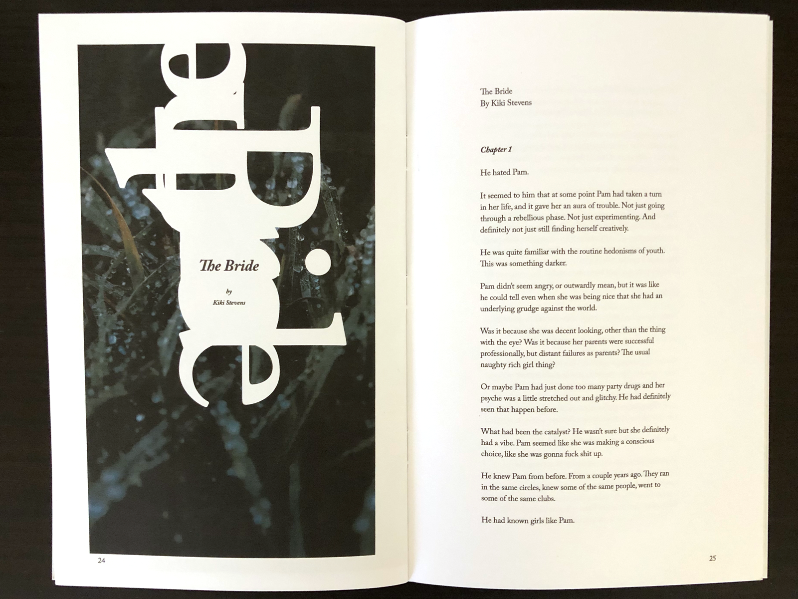
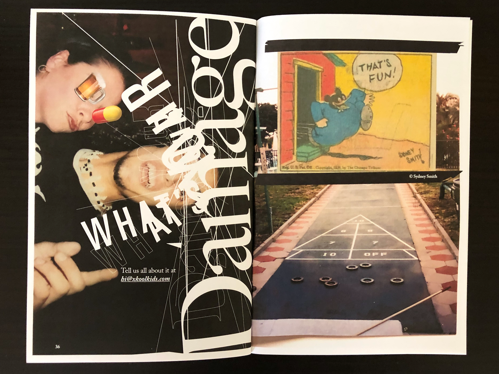
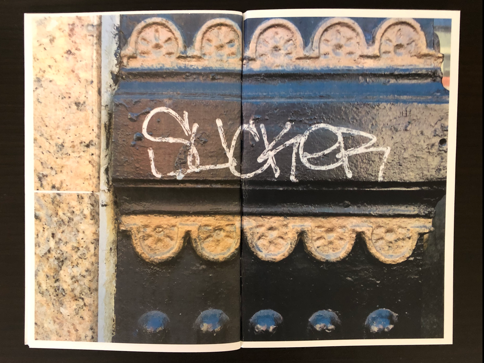
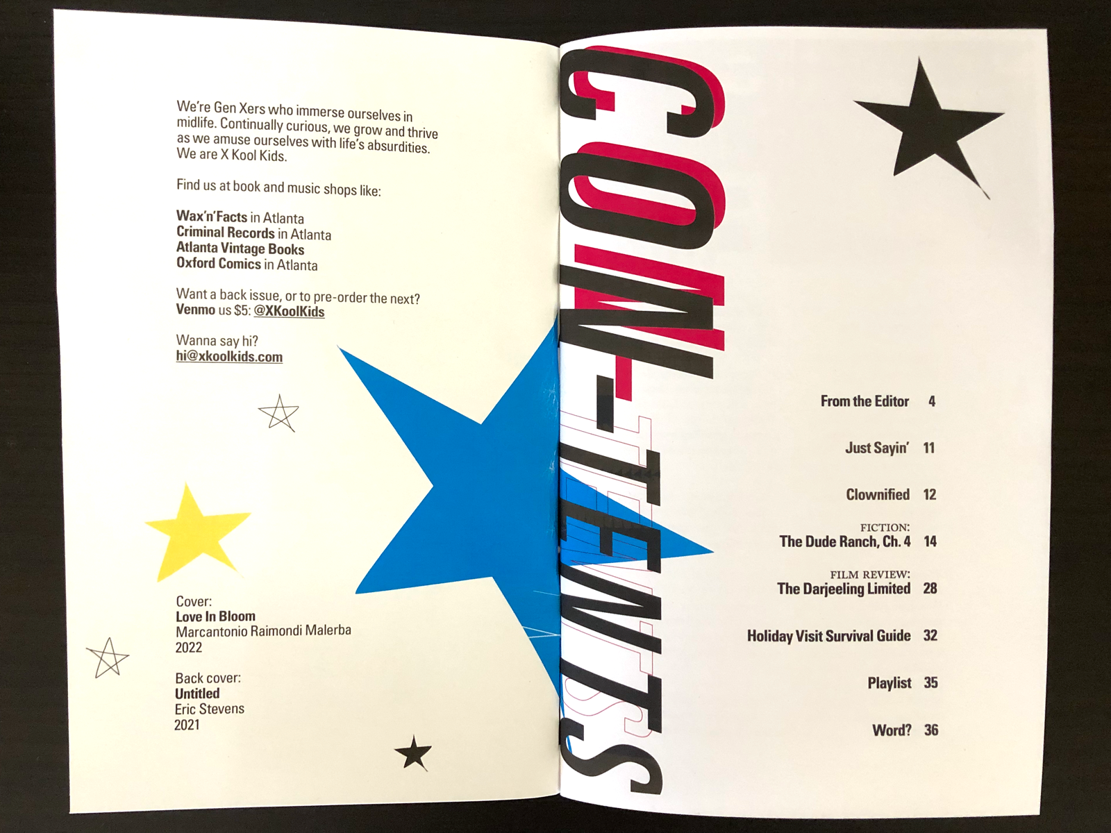
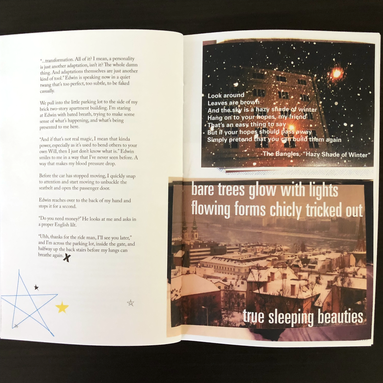
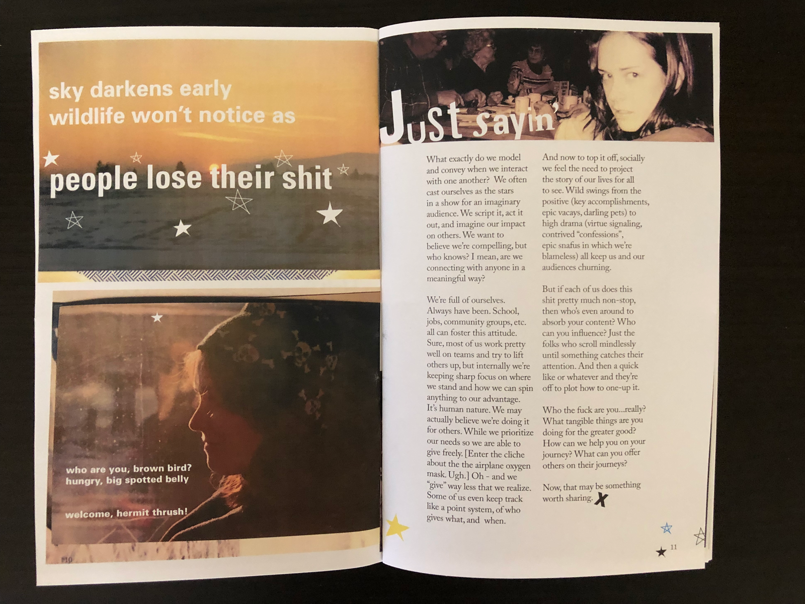
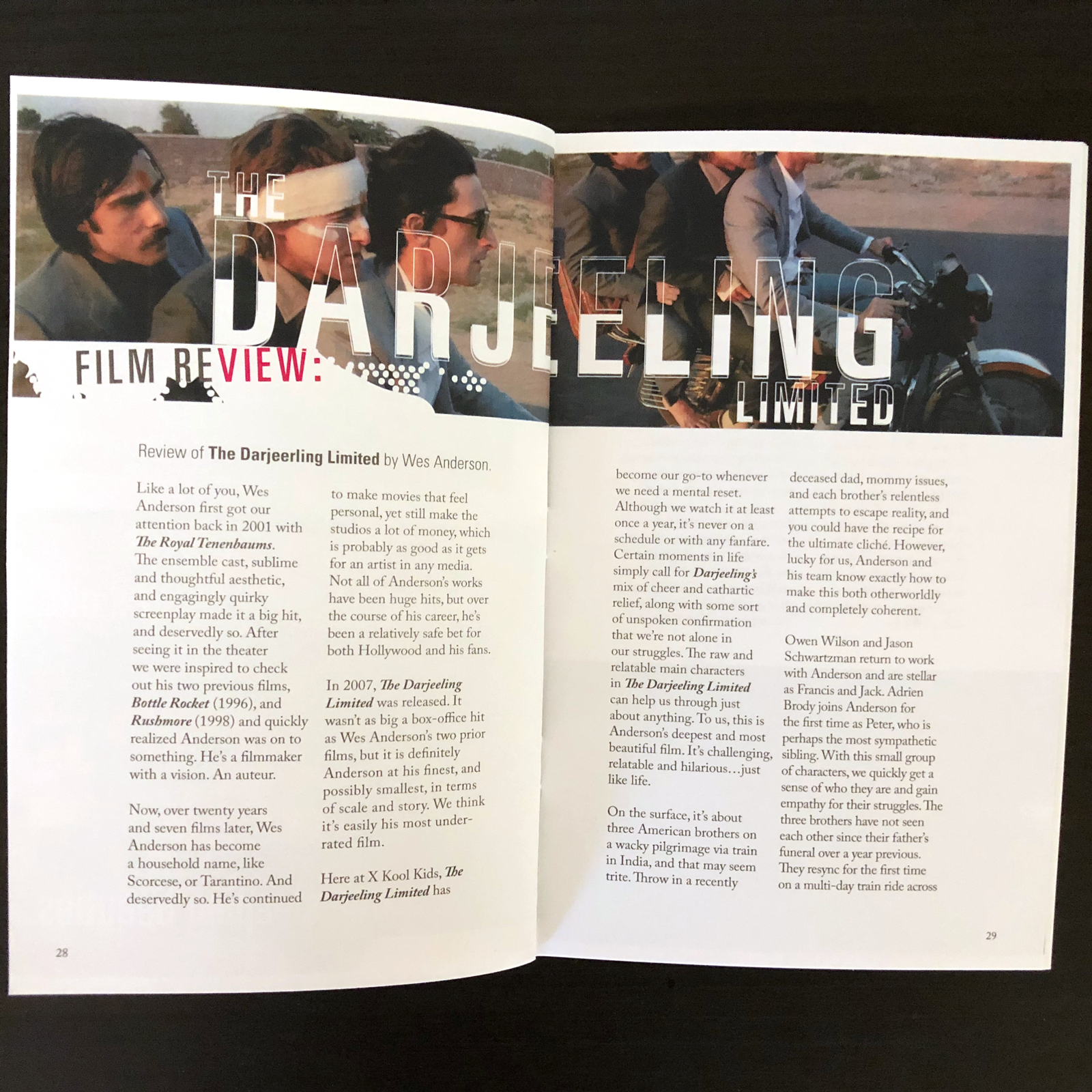
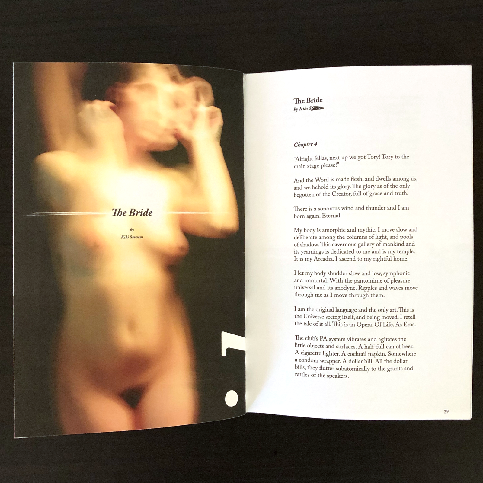
We felt the look should be true to the history of printed zines going back to the independent punk rock zines and flyers of the eighties and nineties, and their DIY analog aesthetic that sometimes feels like you're looking through a handful of shapshots. Very pre-internet. Very tactile. But the visual system also had to be flexible enough to support the wide range of fresh, contemporary content, and seamlessly flow between different emotional and subjective themes.
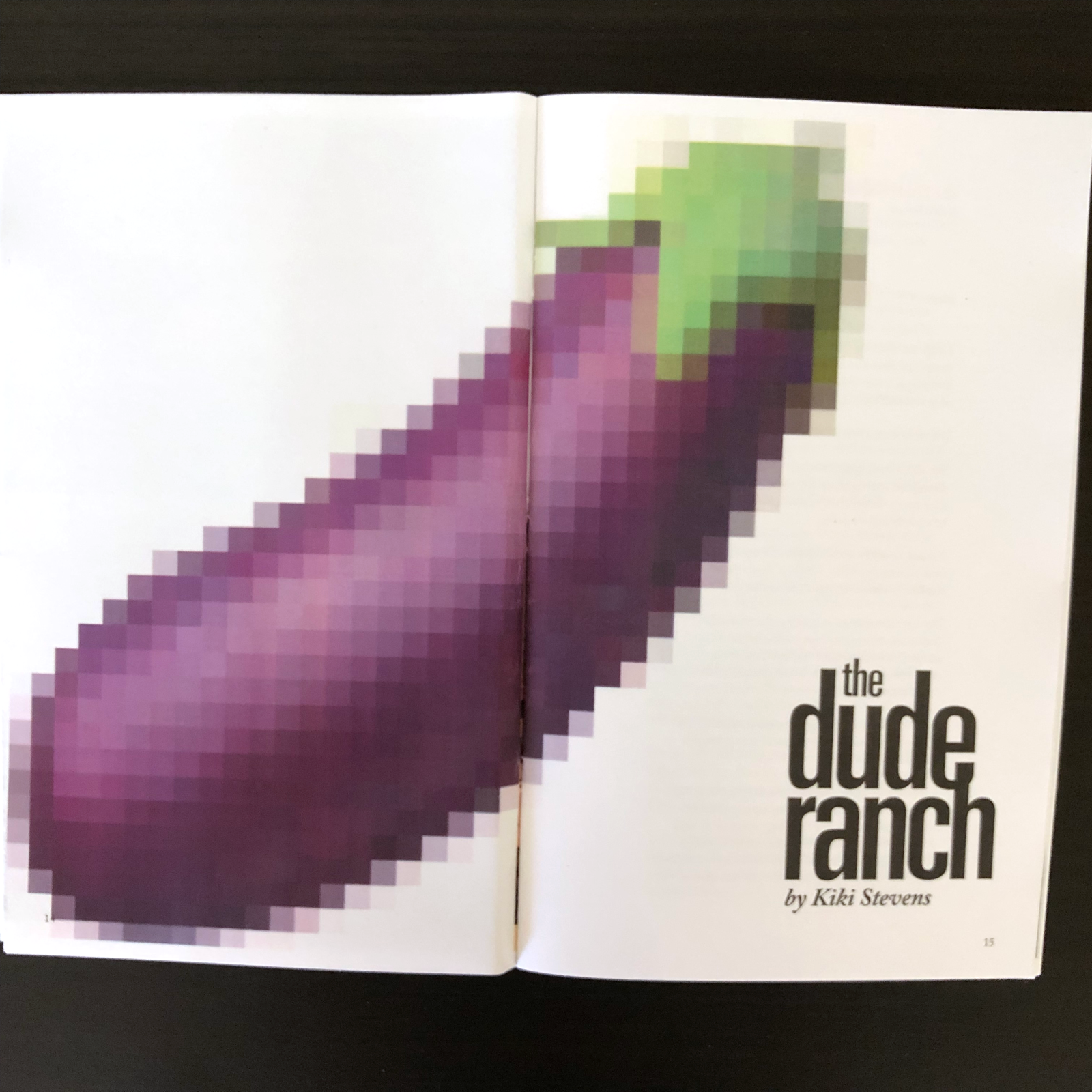
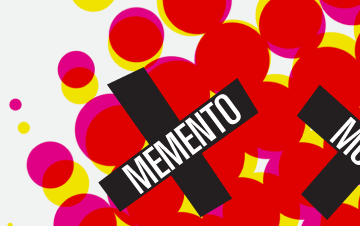
The end result is a fun tight grid system layout that isn't afraid to get messy. It mostly stays in the columns for body copy, but for the header type and imagery, it can get as wild as it wants. And sometimes it looks like someone got to it before you did and doodled in the margins.
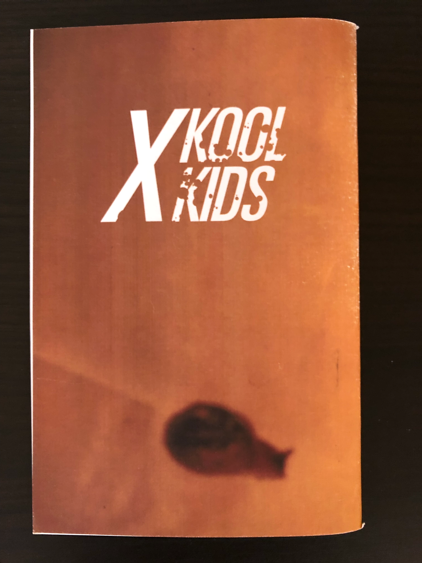
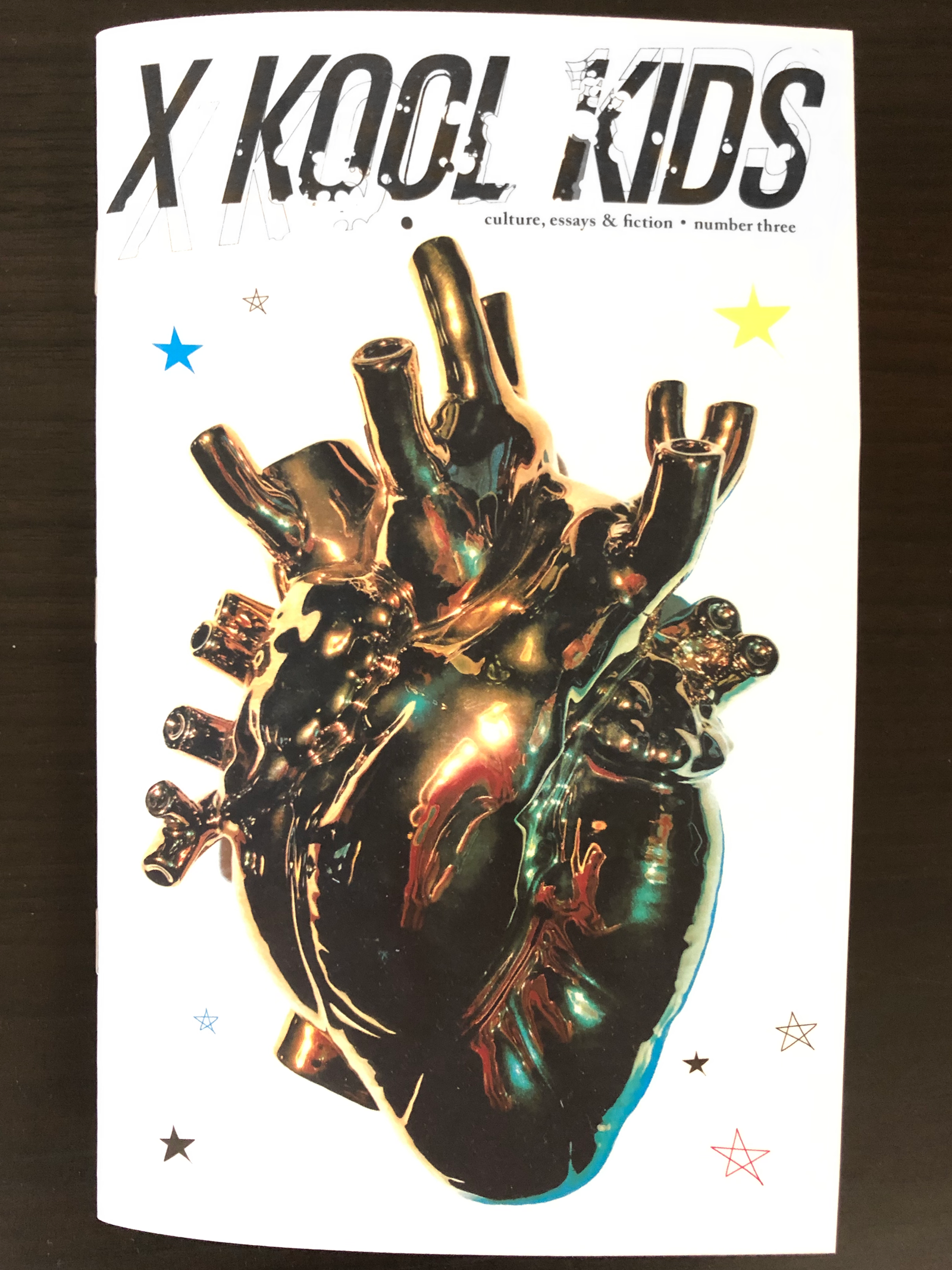
The logotype is similarly pretty simple, bold, flexible, and looks like it can hold it's own when things get rowdy. Definitely some flavor reminiscent of less digital times.
