Stibo Systems is a global leader in Master Data Management. Over the last 30 years, they’ve helped teams across many industries manage master data on a global scale. Their STEP technology lets customers leverage their product information assets and handle the complex product-oriented workflows needed to reconcile product and cross-channel consistencies in order to meet their omni-channel needs.
As the Creative Lead at Stibo Systems, I noticed that the Sales and Marketing team’s presentations were a definite weak spot visually in our brand’s communications. There was very little cohesion to even a basic set of design principles, including imagery and mismatched icons that were obviously grabbed from a Google search. For a number of reasons, I wasn’t able to work with every individual in the company that needed help with their decks.
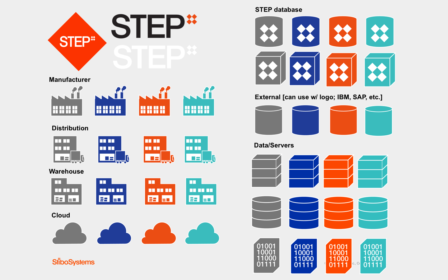
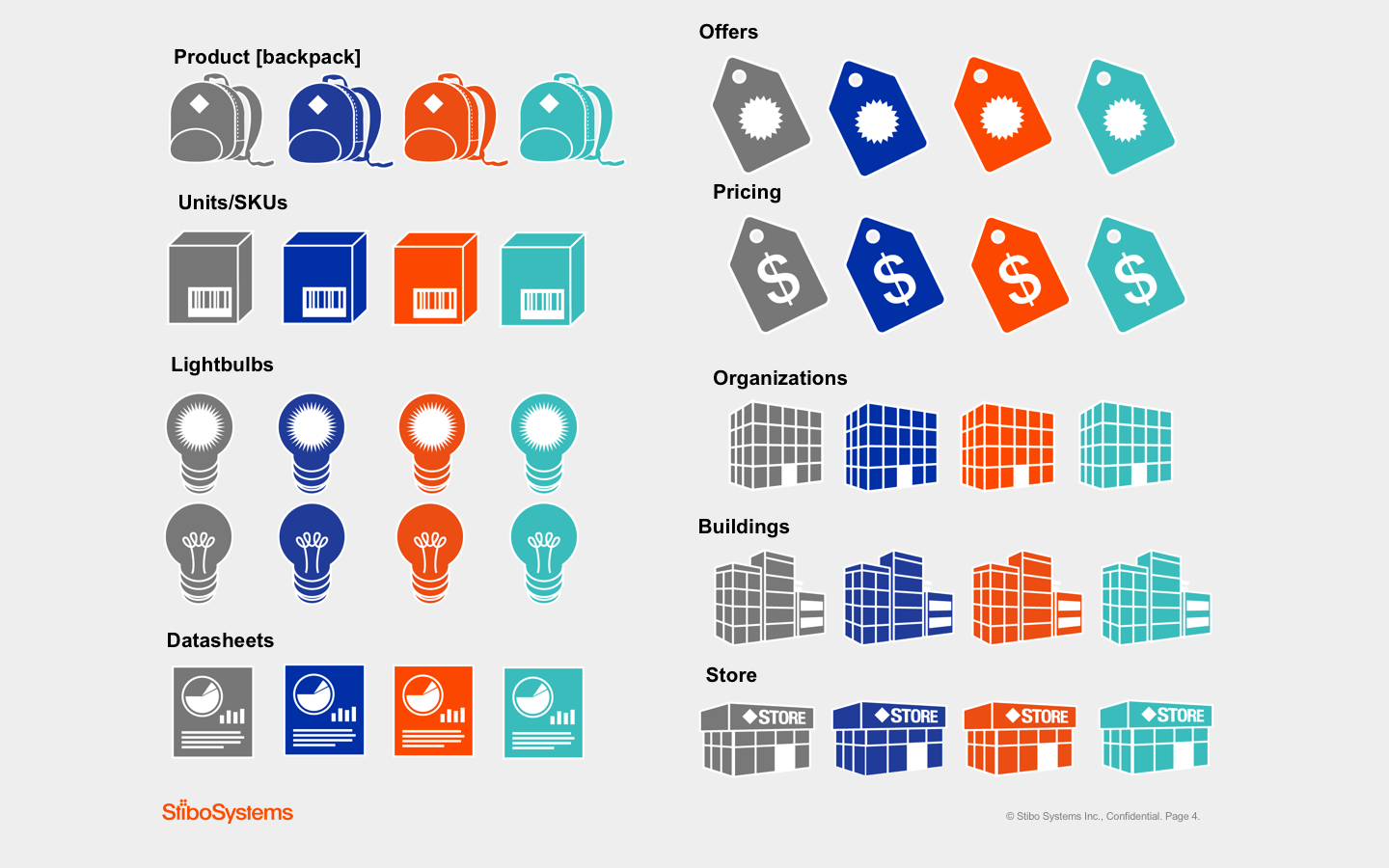
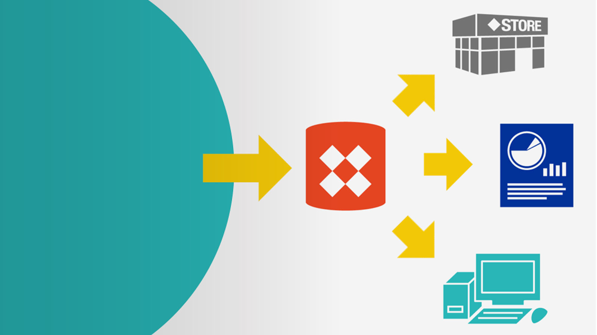
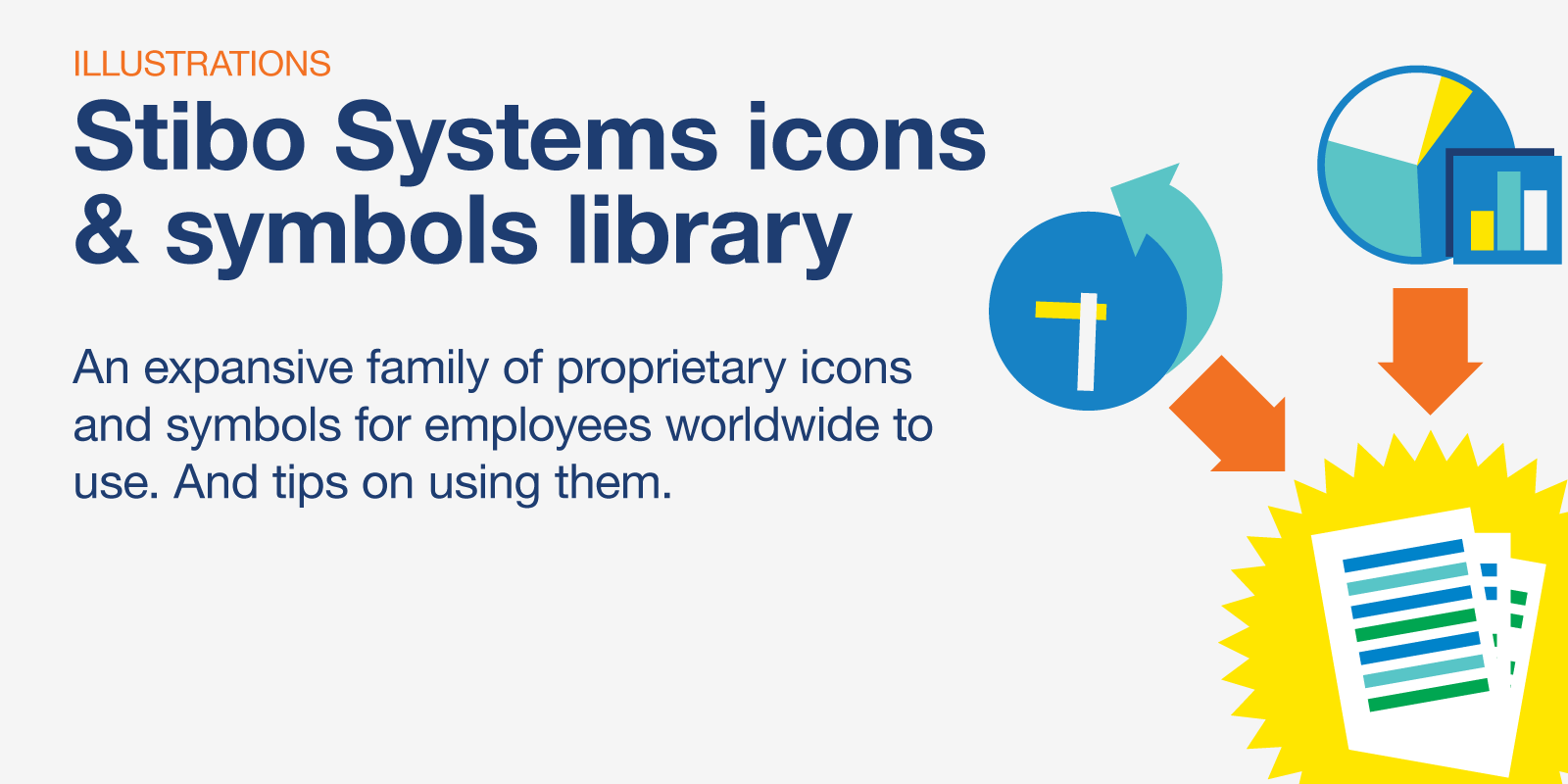
A couple of years prior, I had created a family of sixty illustrated icons for NCR’s Hospitality division to be used in presentations for their marketing team. The impact that they had inspired me to do the same for Stibo Systems as an ongoing pet project. Since I was already illustrating elements for our marketing pieces, in between projects I started working on a library of proprietary icons & symbols and sending them to all Stibo employees worldwide to use.
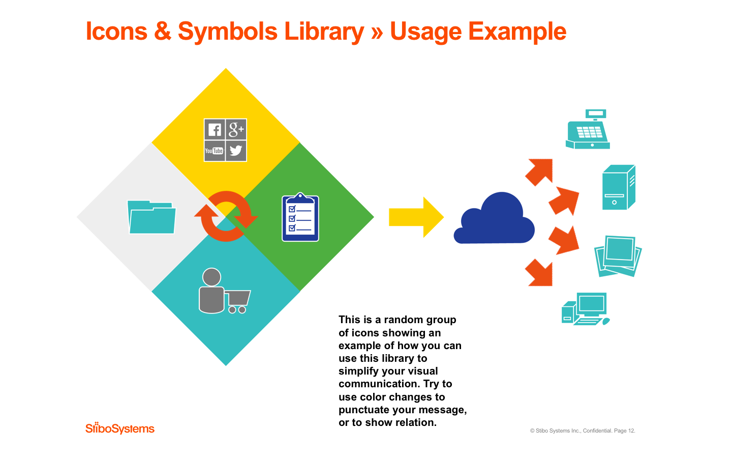
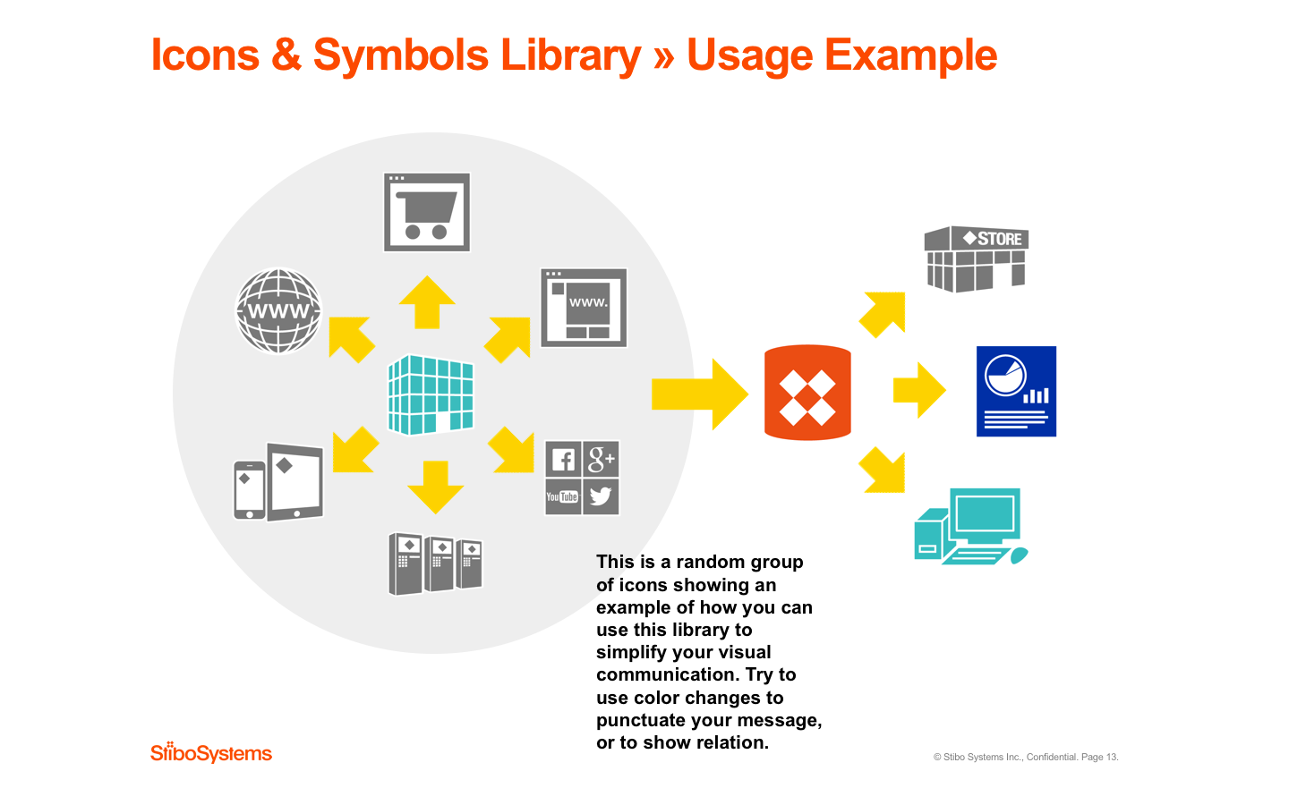
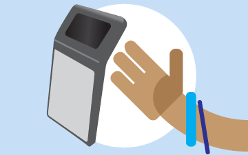
The resulting Icons & Symbols Library includes a presentation template and over 90 icons, each in four different brand colors, various maps, company and product logos, and mockups showing examples of how the system can be used. This way, anyone could improve and unify their decks themselves, ensuring visual brand reinforcement, and hopefully put a stop to use of mismatched clipart of dubious origin. I got great feedback on this often-updated project, and it was quickly adopted company-wide.
