Diamond Eyes is a long-running independent graphic novel and comic book anthology series published annually by artist and writer Neil Britto. It's an intergalactic tale that weaves mysticism, swashbuckling heroes, and good old-fashioned spaceship fights into an epic spiritual journey.
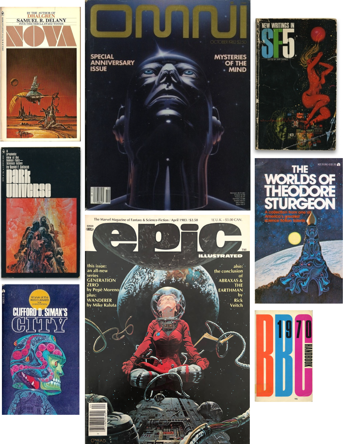
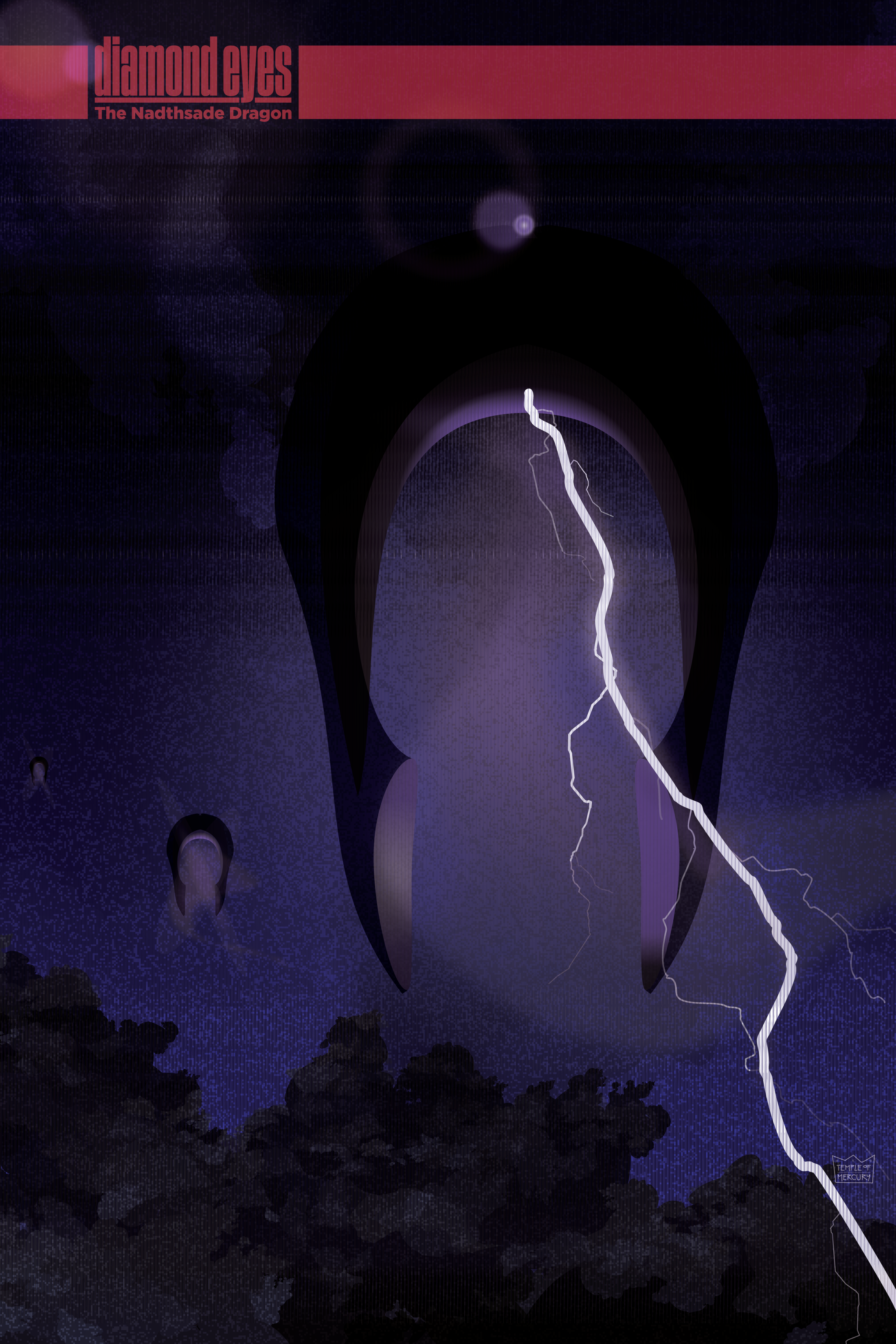
Years ago, Neil and I wanted to find a way to collaborate together a bit on some aspect of his very personal project. Because it's such an individualized vision, I recommended that I would love to take a shot at working out some branding ideas, like cover page imagery and a word mark. Being a big fan of sci-fi and fantastic fiction as a kid, and the graphic novel anthologies like Heavy Metal and Epic Illustrated, I imediately started thinking about all the covers from my youth, the big singular images, and the flavor of the title typography. Even some of the cheap sci-fi paperbacks had a certain stylish vibe.
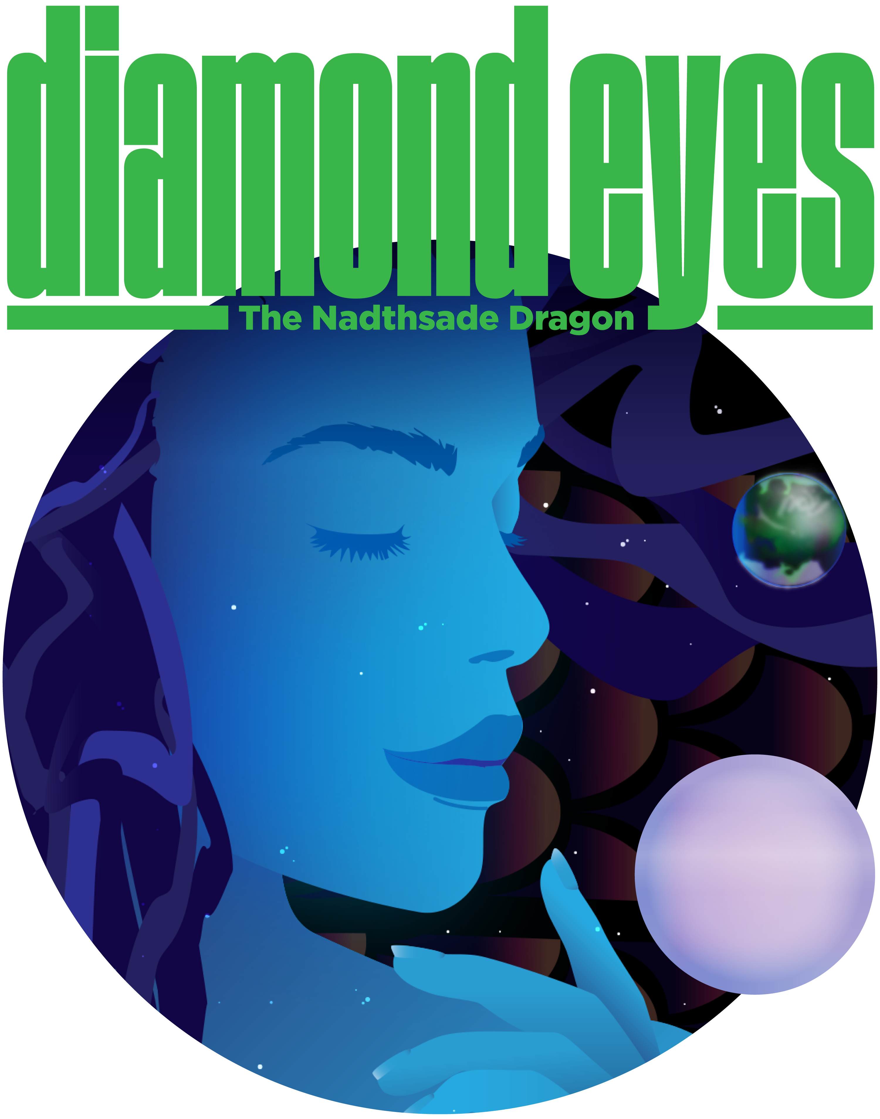
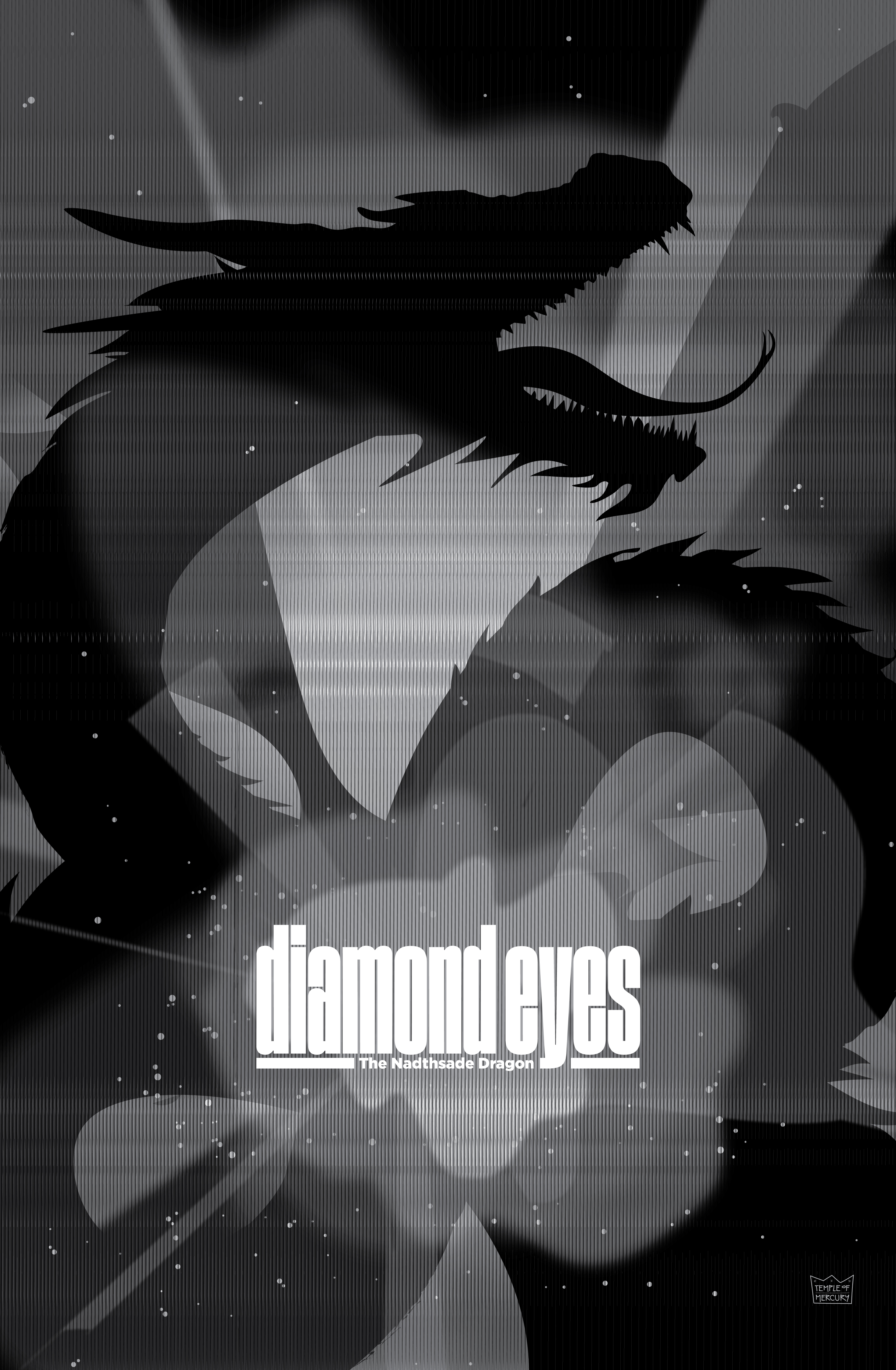
For the title mark I ended up using a modified version of the face Cinderblock by typographer Stefan Kjartansson. It's variable x-heights and hard vertical lines makes it versitile, and retro-future in some ways. For the cover illustrations for each issue, I work with Neil to get some idea of subject, theme, or specific character to potentially focus on, and then I play with different kinds of tone, color combinations, or compositional structures to see what works.
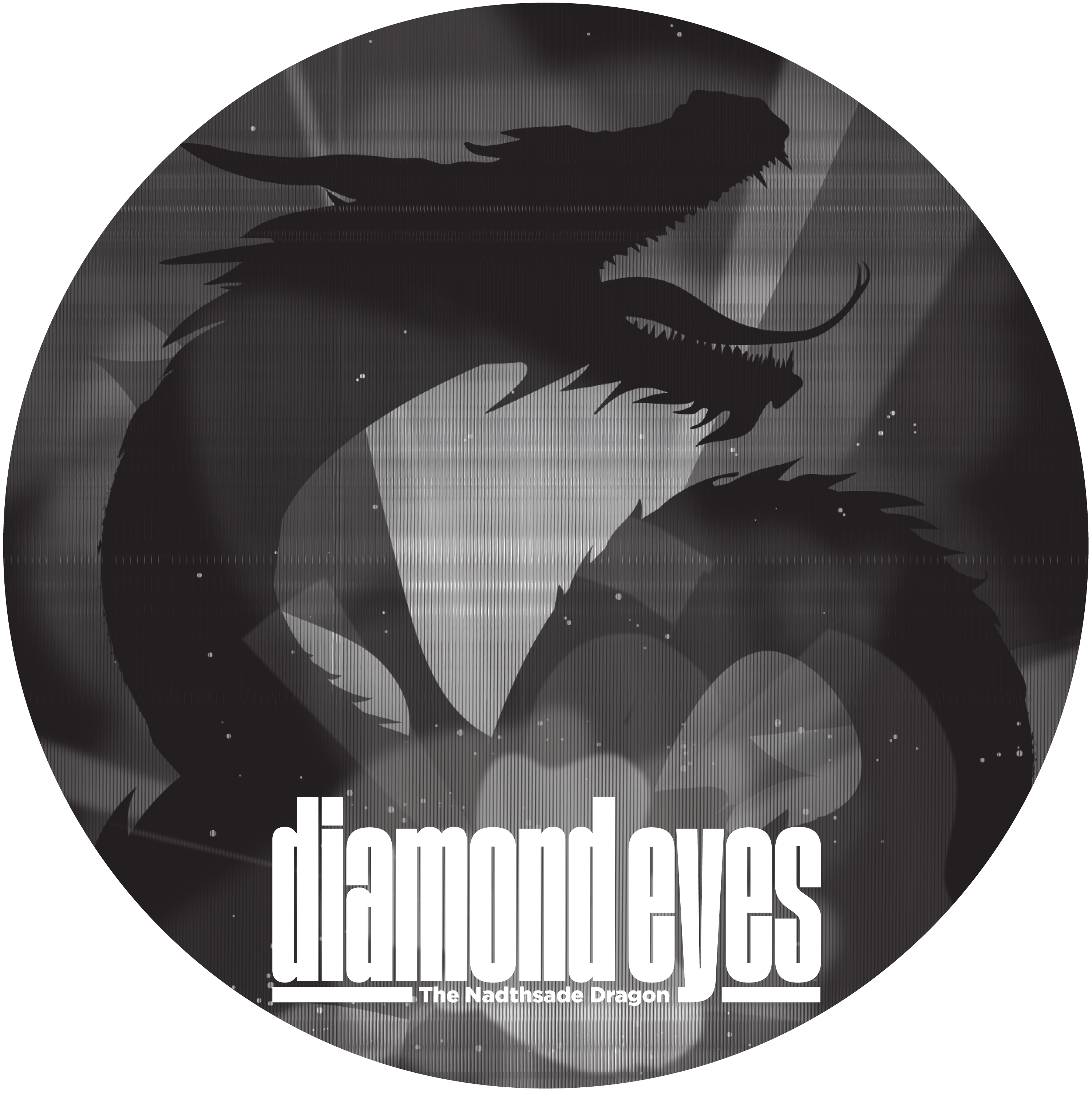
As Neil has expanded the franchise out into the world of merchandise, I've also reworked my covers illustrations as art for tshirts and other branded memoribilia.
